 Search Tips
Part 1: Plotting Fields
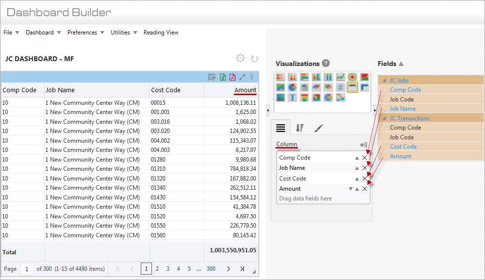
Example of Table Visualization
Column
Drag and drop fields from the Fields pane that are to be columns in the table into the Column box of the Plotting Fields tab.
If the dragged-in field is of the URL data type instead of the String data type, the column’s text is displayed as a hyperlink. A field’s data type can be changed from the String type to the URL type via BI Catalog Builder. For details, please refer to the BI Catalog Builder reference guide.
Also, if a table is created using a special Advanced Analytics view, which is a special view that contains a column with links to each record’s screen, the column with the links, titled Entry Screen, is automatically added to the table. For details, please refer to the upcoming section, Create BI Springboards.
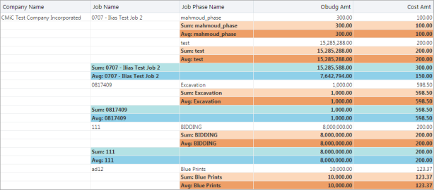
Column Line Aggregation 
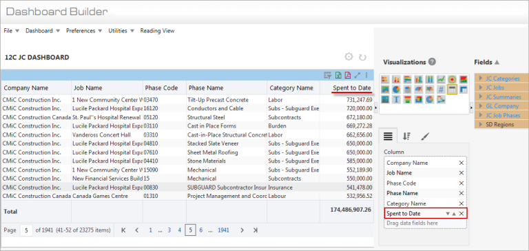
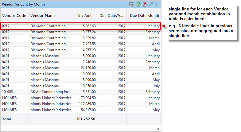
Example of table visualization with a Number data type field
For columns of the Number data type, such as the Spent to Date column in the above screenshot, a down-arrow ( ) is available to select an aggregate function for them, as shown below:
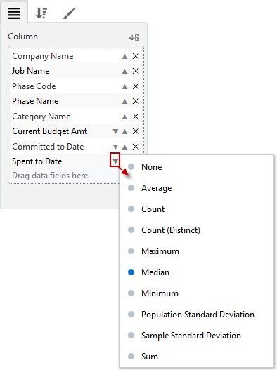
When an aggregate function is selected for a column, the aggregate function is used to calculate a single value for the column, for every unique line.
The uniqueness of a line is determined by the values of its non-aggregated columns, hence the columns to include in the table must take this into consideration.
For instance, in the following screenshot, the Inv Amt column is to be the aggregated column, so the Vendor Code, Vendor Name, Due Date: Year and Due Date: Month column values are used to determine the uniqueness of a line.
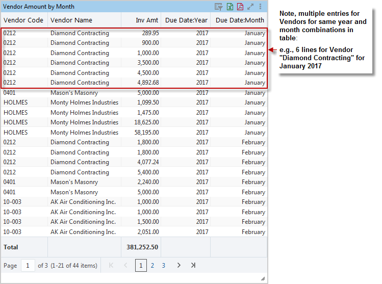
After selecting an aggregate function for the Inv Amt column, the aggregate value for each unique line is calculated, as shown below:
Column Label, Group Sort, Column Aggregation 
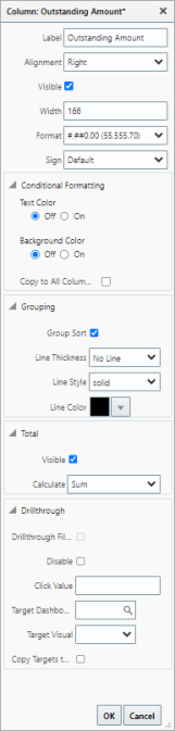
Label
Use this property to change the column’s title. If the column title is changed, hovering over it reveals its default title.
Alignment
Use this property to change the column’s alignment. Alignment options are “Left”, “Centre”, or “Right” aligned. This property is also applied to PDF and Excel exports.
Visible– Checkbox
Use this property to show/hide the column in ADF, PDF exports, and Excel exports.
Format
Use this property to specify the column width in pixels. Column widths can be adjusted by specifying an exact pixel width, or by manually clicking and dragging.
Format
Use this property to specify the number format.
Sign
Use this property to change the final display of numbers without affecting calculations. Available options are "Default", "Reverse", and "Absolute". By default, the "Default" option is selected. Selecting "Reverse" changes the sign of numbers from positive to negative and from negative to positive, and selecting "Absolute" changes the sign of negative numbers to positive.
Conditional Formatting: Text Color, Background Color, Copy to All Columns
Use this property to turn conditional formatting for text color and background color on or off using the 'On' and 'Off' radio buttons. When either the text color or background color property is turned on, a Format Expression link appears below the property. This link is used to launch a pop-up window where format expressions are entered. The 'Copy to All Columns' box is used to copy the column's conditional formats to all columns. Refer to Conditional Formatting to learn more about how this property is used.
Grouping: Group Sort, Line Thickness, Line Style, Line Color(Group Sorting)
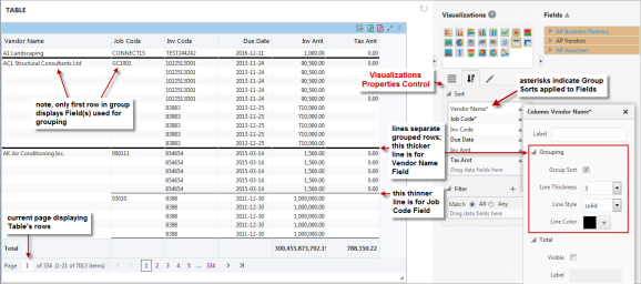
Tables provide the option of group sorting their rows by particular fields (columns).
To create a group sort, click the relevant field’s up-arrow () to launch the pop-up, shown above. In the pop-up, check the ‘Group Sort’ checkbox, and optionally, use the Line Thickness, Line Style, and Line Color properties to select the line’s thickness, style and color.
If more than one field (columns) is to be group sorted, a thick line can be set for the first group sort and a thinner line for the second one, as shown in the previous screenshot. A different line style and line color could also be used for each group sort to further distinguish them.
On the Sorts & Filters tab, fields that are group sorted appear at the top of the Sort box and they have an asterisk at the end of their name.
In the table, as shown in the previous screenshot, rows that are group sorted by fields only have their first row displaying the name of the group sorted fields. If the grouped rows continue to the next table’s page, the first row on the new page displays the field names in italics, as shown below:

Also, for the Visualizations Properties Control, dropping a field that is not group sorted between two fields that are, makes the dropped field a group sorted one.
NOTE: For the Visualization Properties Control, all fields added to the Column box on the Plotting Fields tab are automatically added to the Sort box on the Sorts & Filters tab. Also, if a field is added to the Sort box on the Sorts & Filters tab, it will automatically be added to the Column box on the Plotting Fields tab.
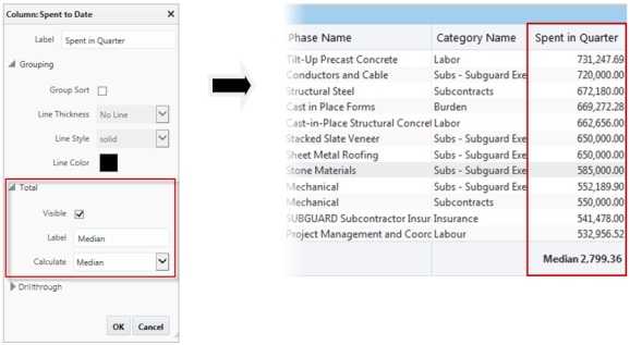
Total: Visible, Label, Calculate(Column Aggregation)
These properties are used to set an aggregate value to display at the bottom of the column, as shown below on the right.
The ‘Visible’ checkbox sets whether or not the aggregate value is displayed for the column, the Label field is used to provide a label for the aggregate value, and the Calculate field is used to select the aggregate function.
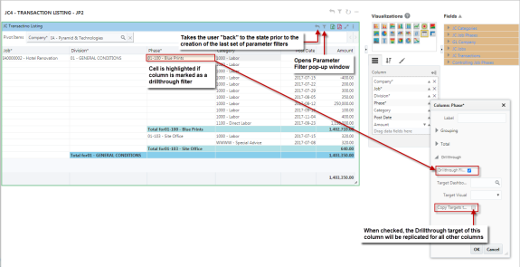
Drillthrough: Drillthrough Filter, Filter Name, Disable, Target Dashboard, Target Visual, Copy Targets to(Drill in Place)

Drillthrough is enabled for a table visualization when a column is marked as a drillthrough filter or has a drillthrough target defined (to a dashboard or a specific visualization on a dashboard).
The ‘Drillthrough Filter’ checkbox is used to mark a column as a drillthrough filter and when checked, enables the Filter Name property. In target dashboards, this drillthrough filter name is used to build context variables and substitution value expressions to reference this filter's selected value(s) as drillthrough filter value(s).
The ‘Disable’ checkbox is used to disable this column’s drillthrough. If checked, the related target drillthrough properties in the panel are disabled (i.e. hidden). If unchecked, drillthrough is enabled and the fields below are visible.
The Target Dashboard property is used to select a dashboard as a drillthrough target. The Target Visual property is used to further drill down into the dashboard to target a specific visualization. The ‘Copy Targets to…’ checkbox, when checked, replicates the drillthrough target defined for the column to all other columns.
NOTE: When a visualization does not have a drillthrough target defined, the current dashboard is the default target. When a drillthrough filter is enabled, it will automatically filter down on the current dashboard without needing to assign a target dashboard. Defining a target dashboard is only used to redirect to other dashboards.
When drillthrough is enabled, each regular cell (not including a subtotal) is clickable. When a cell with drillthrough enabled is clicked, the user is taken to the drillthrough target defined for the column. When the column does not have a drillthrough target defined, the current dashboard is the default target.
Each drillthrough filter cell value on the row is sent to the target as a parameter filter.
Pivot Items can also be marked as a drillthrough filter.
When Drillthrough is enabled for a table visualization, and the cells are clickable, the user can enable text selection by using the Visualization drop-down menu and selecting “Enable Text Selection”.

Crosstab View
Refer to Crosstab for more details on using this functionality.
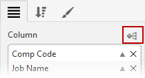
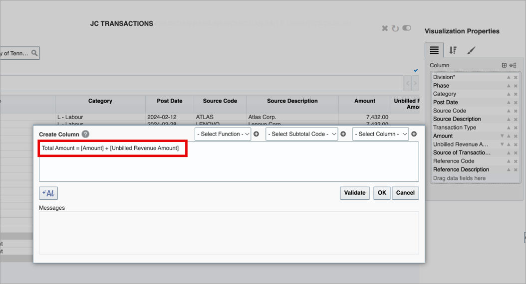
Calculated columns can be created in BI Dashboard Builder for a table visual by clicking the New Calculated Column icon ( ) next to the Subtotals icon. Clicking on this icon launches the Create Column pop-up window, as shown below.

The drop-down lists are used to make selections and the Insert icon (  ) is added to each list to explicitly insert the selected value. Every calculated column expression starts with the column name then an equal sign (=) followed by an expression. For example, the following expression creates a Total Cost calculated column by multiplying the Unit Cost to Quantity.
Total Cost = [Unit Cost] * [Quantity]
Calculated columns can participate in almost all existing features such as QBE, pivoting, visual filtering, card view, etc. However, it cannot be marked as a drill-down filter and it cannot be aggregated.
A calculated column may not be created from another calculated column. It can be created from number columns only. Therefore, a calculated column’s data type is always number. A calculated column is computed after the columns used in its expression.
To simplify the creation of calculated columns, the AI Assistant can generate numeric expressions based on plain-language input. These expressions are ready to use or can be refined further to meet your specific needs. For more details, refer to Using AI Assistant for Calculated Columns.
Expression Operators and Precedence Rules
A calculated column expression supports the following arithmetic operators:
+ (addition)
- (subtraction)
* (multiplication)
/ (division)
Parentheses can be used in an arithmetic expression to change the order of evaluation. In an expression like:
New Amount A = ([Number Column 1] - [Number Column 2]) / [Number Column 3]
the part of the expression within the parentheses, ([Number Column 1] - [Number Column 2]), is evaluated first, and then the result is used in the rest of the expression.
Column Reference
A column reference is a column name enclosed in square brackets ([ ]) in the following format:
[Column Name]
Functions
A calculated column expression may contain functions. When a function is executed, a single value is returned, and then the value is used in the rest of the expression. The following functions are currently supported:
count
Returns the number of cells in a column that contain non-blank values.
Syntax:
count (<column reference>)
distinctCount
Returns the number of distinct cells in a column that contain non-blank values.
Syntax:
distinctCount (<column reference>)
maximum
Returns the largest number in a column.
Syntax:
maximum(<column reference>)
minimum
Returns the smallest number in a column.
Syntax:
minimum(<column reference>)
median
Returns the median of the numbers in a column.
Syntax:
median(<column reference>)
average
Returns the average of the numbers in a column.
Syntax:
average(<column reference>)
sum
Add all numbers in a column.
Syntax:
sum(<column reference>)
populationStandardDeviation
Returns the population standard deviation (square root of variance) of non-blank values in a column.
Syntax:
populationStandardDeviation (<column reference>)
sampleStandardDeviation
Returns the sample standard deviation (square root of sample variance) of non-blank values in a column.
Syntax:
sampleStandardDeviation (<column reference>)
subtotal
Returns the subtotal values that can be part of a calculated column expression.
Syntax:
subtotal(<subtotal code>, <column reference>)
Subtotals 
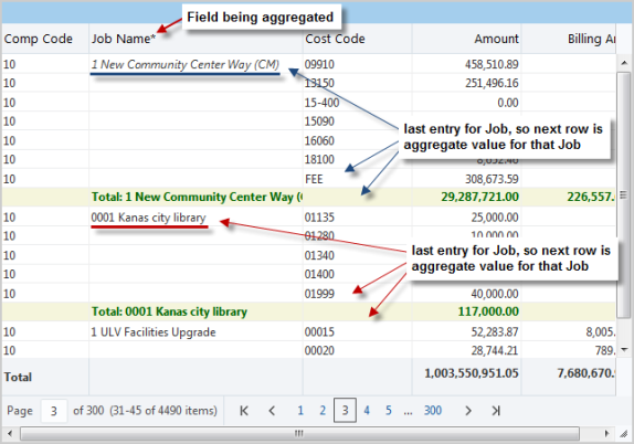
Example of table visualization with various subtotals set up
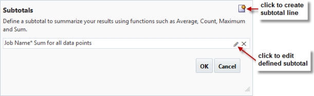
To create a subtotal line, click the Subtotals icon, shown below:
NOTE: Subtotals are not computed for columns that are group sorted.
In the pop-up, click the New icon, pointed to below:
In the Create Subtotal pop-up, define the subtotal line, using the following details.

Calculate
Use this field’s LOV to select the aggregate function that is to be applied to the field selected via the Place subtotal at each change in field.
of all data points

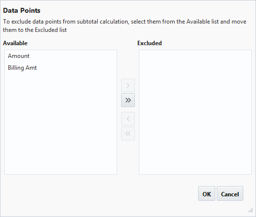
By default, all numerical fields will have an aggregate value calculated. This pop-up is used to exclude a field from having its aggregate value calculated.
Place subtotal at each change in
Select the field that is to be aggregated.
For each unique value of the field (e.g., if the field is “Job”, then for each job), the calculated aggregate value for it will be displayed just after the last entry for that field.
Don’t display subtotal for a single row
If checked, single rows will not have an aggregate value calculated.
Label
Label for aggregate value rows.
Append Value– Checkbox
If checked, name of field being aggregated will be appended to label identified in Label field above.
Bold
If checked, text for aggregate value rows is in bold.
Font color
Color of text for aggregate value rows.
Background color
Background color for aggregate value rows.
Using AI Assistant for Calculated Columns
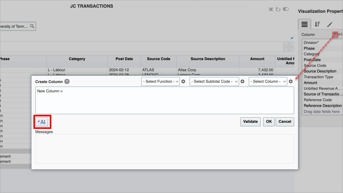
An [AI] button is available in the Create Column pop-up window to assist with building calculated columns. This AI Assistant streamlines the process by converting natural language inputs into accurate switch statements designed specifically for number-based calculations. Users can instantly review, copy, or tweak the generated code, eliminating the need to manually write logic from scratch.
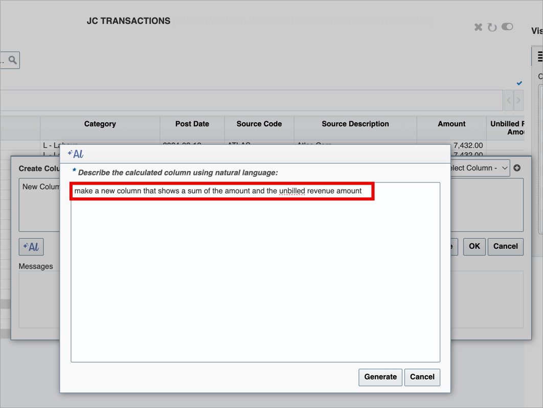
After clicking the [AI] button, enter a description of the column using natural language in the AI pop-up window. When you are ready, click the [Generate] button to create the calculation.
The AI Assistant will generate the appropriate numeric expression for you. Click [OK] to apply the calculation directly to your data
Part 2: Sort & Filter
Tables have unique sorting options for their rows, explained here. For general details about sorting rows, please refer to Sort and Filter – Tab.
For tables only, the fields in the Sort box on the Sorts & Filters tab can be reordered by dragging and dropping them to their new positions, which changes the order by which rows are sorted (rows are first sorted by first field, then by second one and so forth).
The arrows next to the fields indicate their sort order. The up arrow ( ) indicates that the ascending sort order is used, and the down arrow indicates that the descending sort order is used. Click the arrows to switch between the two sort types.
NOTE: All visualizations, including tables, can filter by aggregation. For table visualizations, the table must have at least one aggregate column (aggregation is not “None”).
Part 3: Format

Title
Visible– Checkbox: Used to show/hide the title.
Text: Used to set the title for the visualization, which is displayed along its header.
Text Color : Used to set the text color of the visualization's title.
Background Color: Used to set the background color of the title.
Export to PDF 
The following are options for the Export Table to PDF functionality. For details, please refer to the Export Table to PDF subsection.
Orientation
PDF’s page orientation. Options are “Landscape” or “Portrait”.
Size
PDF’s size. Options are “Letter” or “Legal”.
Hide Logo– Checkbox
Allows user to hide PDF/query logo.
Logo
File name of uploaded logo for exported PDF. To clear this field, use the Delete or Backspace keyboard key.
NOTE: If this field is left empty, the logo will default from the Dashboard Logo Image Path field on the Logo Path tab of the System Options screen (standard path: System > Setup > System Options – Logo Path tab).
Crosstab View
Launch as Crosstab View - Checkbox
Allows the user to set the visualization to launch in crosstab view by default.
Refer to Crosstab for more details on using this functionality.
Show Layer - Checkbox
Allows the user to show layer headers in crosstab view.
Drillthrough (Target Dashboard, Target Visualization)
Use the Target Dashboard property to select a dashboard as a drillthrough target.
Use the Target Visualization property to further drill down into the dashboard to target a specific visualization.
Other
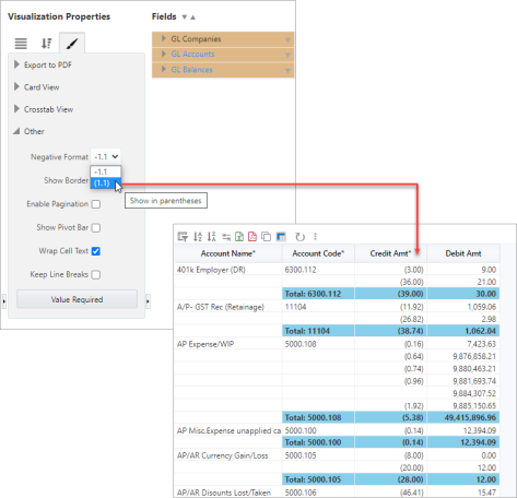
Negative Format
Use this property to specify the format for negative numbers. By default, negative numbers are displayed with a minus sign, but there is also an option available to display them in parentheses.
For example:
Width
Shows the width of the visualization. This field is editable to allow the user to adjust the width.
Height
Shows the height of the visualization. This field is editable to allow the user to adjust the height.
Show Border – Checkbox
Check to apply border to visualization.
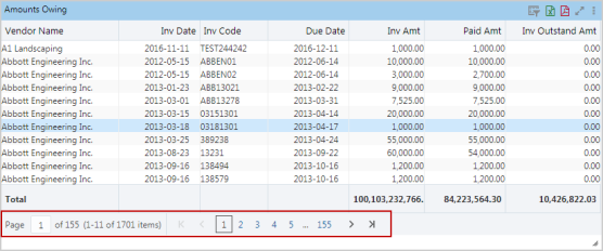
Rows Per Page
Available if ‘Enable Pagination’ box is checked, to set number of rows to display per page of table.
Enable Pagination – Checkbox
If checked, a table visualization’s rows span over pages, as shown below:
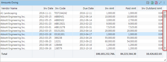
If unchecked, a scrollbar is used to view a table’s rows, as shown below:
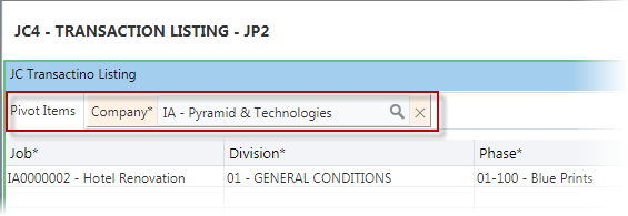
Show Pivot Bar – Checkbox
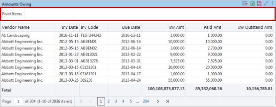
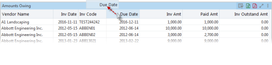
If checked, the Pivot Items bar appears above the table’s columns, as shown above. Alternatively, during runtime, the Pivot Items bar can be made available by dragging and dropping a column header onto the table’s title bar, as shown below:
The Pivot Items bar is used at runtime to filter the table by entries in one or more columns.
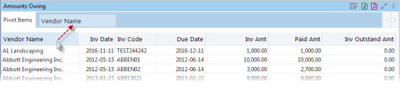
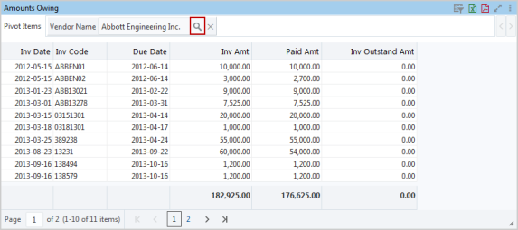
For instance, using the above table as an example, if you want the table to display data for a particular vendor, drag and drop the Vendor Name column header onto the Pivot Items bar, as shown below:
Next, click the  icon (framed below) to select one or more vendors by which to filter the table’s data. Hold the Ctrl or Shift keyboard keys to select more than one item.
As shown below, more than one column can be dragged and dropped onto the Pivot Items bar:

To clear a Pivot Item’s selected item, use the Delete or Backspace keyboard key.
Wrap Cell Text
If checked, when a column is not wide enough to fully display its text, the height of the row is increased to fully display the text. Note, however, text wrapping does not occur for columns with a subtotal defined, or columns with a group sort defined with the Line Thickness property set to anything other than “No Line”.
If not checked, when a column is not wide enough to fully display its text, the height of the row does not change, and the text is cut off.
Keep Line Breaks
This option is available if the ‘Wrap Cell Text’ box is checked, and it is used to preserve text formatting.
[Value Required] - Button
This button is used to launch the Value Required pop-up window, where available dashboard filters/substitution variables are listed. Refer to Value Required for more information.