Visualizations – Pane
Overview
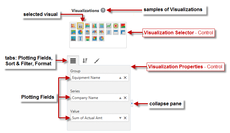
The Visualizations Pane is only available when the screen is in Editing View mode, and its Visualization Properties control is only visible if a visualization has been selected in the dashboard canvas.
This pane is used to create and configure the dashboard’s visualizations, using its Visualizations Selector and its Visualization Properties controls.
Visualizations Selector – Control
The Visualizations Selector contains visualization icons that are clicked to add a new visualization to the dashboard, or clicked to change a selected visualization on the dashboard canvas to the clicked one.
If a visualization is selected on the dashboard canvas, its corresponding visualization icon in the Visualizations Selector is grayed out and its outline is highlighted.
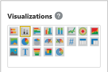
The Help Icon ( ) can be clicked to view the Visualization Catalog, which contains graphical samples of the visualizations, in a new browser tab.
Visualization Properties – Control
This section provides an overview of the Visualization Properties control, which is comprised of the following three tabs: Plotting Fields, Sort and Filter, and Format.
Plotting Fields – Tab

Bar, Column, Line, Area & Treemap Charts; Pie & Funnel Charts; Gauges; Tables; Images, Text
As shown above and explained below, the Plotting Fields tab differs between visualization types:
-
Charts: Used to set which fields from the data source get graphed.
-
Gauges: Used to set what field’s aggregate value is displayed; and optionally, what fields’
aggregate values are used to set the gauge’s minimum, maximum and target values. -
Tables: Used to set what fields are to be its columns.
-
Images/Text: Used to set which field is used to display an image or text.
As shown in the Stacked Column Chart example below, to set what fields get graphed, drag and drop them from the Fields pane into the relevant plotting fields in the Visualizations pane:

For details about the plotting fields of each visualization type, please refer to the relevant subsection under the following
Sort and Filter – Tab

The Sort and Filter tab is used to sort and filter the data displayed by the visualization. The following sections provide details about the Sort and Filter parameters.
Sort
To sort the items of a Group, Series or Column plotting field, drag the field by which to sort the items into the Sort box. If a single folder is used to create the visualization, only fields within it can be used for sorting; and if joined folders are used to create the visualization, only fields in the returned rows can be used for sorting.
By default, the sort method used is ascending, as indicated by the up-arrow icon (  ). Click the arrow to change the sort method to descending, which is identified by the down-arrow icon (
  ).
).
More than one sort parameter can be specified, in which case data is first sorted by the first sort parameter, then by the second one and so forth.
To delete a sort parameter, click its corresponding Delete icon ( ).
).
Filter
This parameter is used to create a filter expression, comprised of comparison operators and values to compare against, to perform two types of filtering:
-
Data Filter
Filter rows (data) used to create visualization (i.e., filter rows in folder or filter returned rows of joined folders).
-
Group/Series Filter
Filter groups along groups axis, if only the Group plotting field is specified, or filter series in visualization, if the Series plotting field is specified.
A filter expression can be a simple filter expression (e.g., “Invoice Amount is not blank”) or a composite filter expression that is comprised of two or more simple filter expressions joined by the “And” or “Or” conjunction (e.g., “Invoice Amount is not ‘0’ And PO Number is not blank”).
The following are the steps to create a simple filter expression, which are repeated to create a composite filter expression.
Create Simple Filter Expression:
-
Drag and drop the field to filter against from the Fields pane into the Filter box.
-
Group/Series Filter Type: If and only if this simple filter expression is to be of the Group/Series Filter type, instead of the Data Filter type, click the down-arrow icon (
 ) to select the relevant aggregate function; otherwise, skip this step.
The selected aggregate function is applied to the field dragged into the Filter box, and its result is used to filter the groups if only the Group plotting field is specified, or series, if the Series plotting field is specified.
If Groups are being filtered: the calculated aggregate value for each group is compared to the value that will be specified using the
 icon in step 3, and if a group’s value does not meet the criteria, it will not appear in the visualization.
If Series are being filtered: the calculated aggregate value for each series is compared to the value that is to be specified using the
icon in step 3, and if a series’ value does not meet the criteria, it will not appear in the visualization.Example:
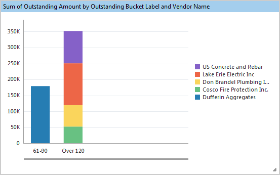
For the following Stacked Column Chart, each Group’s aggregate value is broken down into aggregate values for each Series (vendor).

If the following simple filter expression of the Group/Series Filter type is used:
“Sum of Outstanding Amount is greater than 50 000”
Then all series with a sum equal to or less than 50 000 will not be included in the chart, as shown below:
-
To create the simple filter expression, click the up-arrow icon (
) to specify the comparison operator and the actual value to compare against the dragged-in field. For filters of the Data Filter type, the comparison operators available depend on the data type of the dragged-in field. For instance, if the dragged-in field is of the date type, the following notable comparison operators are available in the pop-up launched by clicking the filter parameter’s up-arrow (
): is after, is on or after, is before, is on or before; and a time may be specified for the entered date by unchecking the ‘Ignore Time’ checkbox in the pop-up.For filters of the Group/Series type, the comparison operators available depend on the aggregate function’s type.
Create Composite Filter Expression:

When creating composite filter expressions, the brackets matter in its evaluation. The following are details about how brackets are applied:
-
Each new simple filter expression is encapsulated by brackets.
-
Filter parameters can have up to two simple filter expressions, (created in
icon’s pop-up), and they are encapsulated by brackets. -
Filter parameters within each filter box are encapsulated by brackets, as shown in above screenshot.
NOTE: Bolded conjunctions indicate that they are between expressions in filter boxes.
To view the created filter expression, click the  icon. If no expression is shown, one has not been fully completed.
-
To create a composite filter expression, after creating a simple filter expression, either:
-
Drag and drop the field to use for the next simple filter expression into a Filter box, which automatically joins the new expression to the previous one in the box, if there was one, using the conjunction selected for the Filter box.
OR
-
Click a previously specified filter parameter’s
icon to add another simple filter expression in its pop-up, and use the ‘And’ or ‘Or’ radio button to select the conjunction with which to join them.OR
-
Click the add icon (
 ) to add another filter box, then drag in the field to use for its simple filter expression, and use the ‘And’ or ‘Or’ radio button to select the conjunction with which to join the new expression to the one of the previous filter box.
-
Continue creating the simple filter expression as explained by the second or third step of the preceding Create Simple Filter Expression steps.
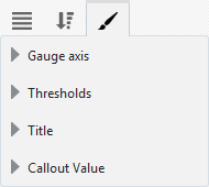
Format – Tab


Bar, Column, Line & Area Charts; Gauges; Pie Charts, Funnels, Tables, Images, Text
As shown above, the Format tab also differs between visualizations. It is used to format the visualization and to provide a title for it, which is displayed along the visualization’s header.
For details about this tab for each visualization type, please refer to the relevant subsection under Visualizations.