Part 1: Plotting Fields
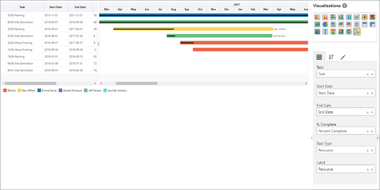
Example of Gantt Chart Visualization
The Gantt Chart visualization enables users to see information that has start and end dates, in a way that is useful for resource planning and other project planning.
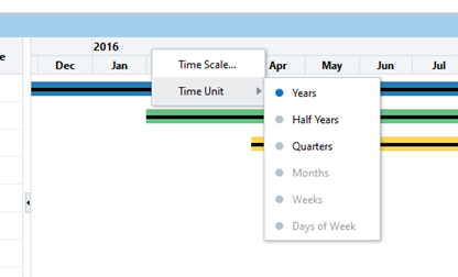
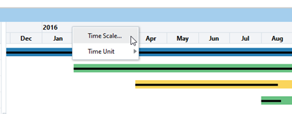
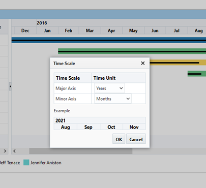
Right-click on a header to show the Time Scale menu, as shown in the screenshots below.
Part 2: Sort & Filter
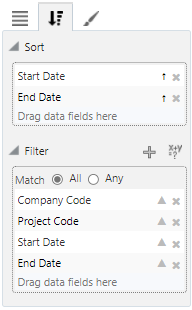
For details about filtering the data used by a Gantt Chart, please refer to Sort and Filter – Tab.
Part 3: Format
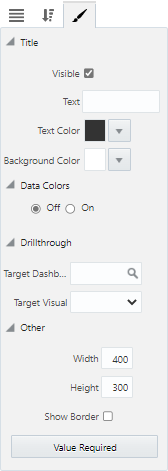
Title
Visible – Checkbox: Used to show/hide the title.
Text: Used to set the title for the visualization, which is displayed along its header.
Text Color : Used to set the text color of the visualization's title.
Background Color: Used to set the background color of the title.
Data Colors
Off/On: Used to turn the Data Colors property on and off. Selecting the 'On' radio button launches a pop-up window where colors can be specified for each data series in the visual. Users can choose between a Basic and Advanced color editor. Refer to Color Controls for more information on how this property is used.
Drillthrough
Target Dashboard: Used to specify a drillthrough target to a dashboard.
Target Visual: Used to specify a drillthrough target to specific visual on a dashboard (when a target dashboard has been selected in the Target Dashboard field above).
Other
Width: Shows the width of the visualization (editable to allow the user to adjust width).
Height: Shows the height of the visualization (editable to allow the user to adjust height).
Show Border – Checkbox: Check to apply border to visualization.
[Value Required] - Button
This button is used to launch the Value Required pop-up window, where available dashboard filters/substitution variables are listed. Refer to Value Required for more information.