Color Controls
Users can control the colors that appear in visualizations to better visualize data the way they want, and to match colors between visuals.
Color controls are available for the following visualizations:
-
Stacked bar chart
-
Stacked column chart
-
Clustered bar chart
-
Bar chart (polar)
-
Line chart
-
Line chart (polar)
-
Area chart
-
Stacked area chart
-
Pie chart
-
Pie chart (3D)
-
Funnel chart
-
Gantt chart
-
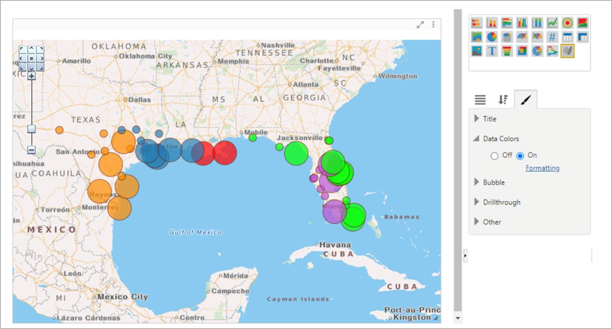
Bubble map
In the Format tab of the visualization, the Data Colors property is used to turn the feature on and off. Selecting the 'On' radio button launches a pop-up window where colors can be specified for each data series in the visual.
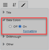
Data Colors Property
Users can choose between a Basic and Advanced color editor.
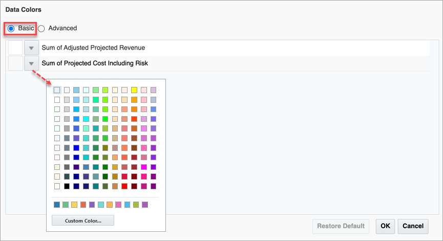
Basic Color Editor
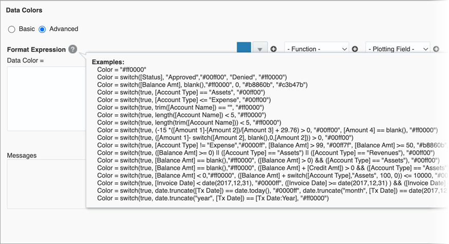
The Advanced editor allows the user not only to set colors based on series values, but based on a myriad of conditions.
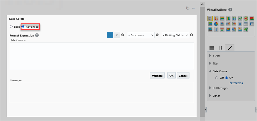
Advanced Color Editor
Visualization with Data Color Formatting Applied