Part 1: Plotting Fields
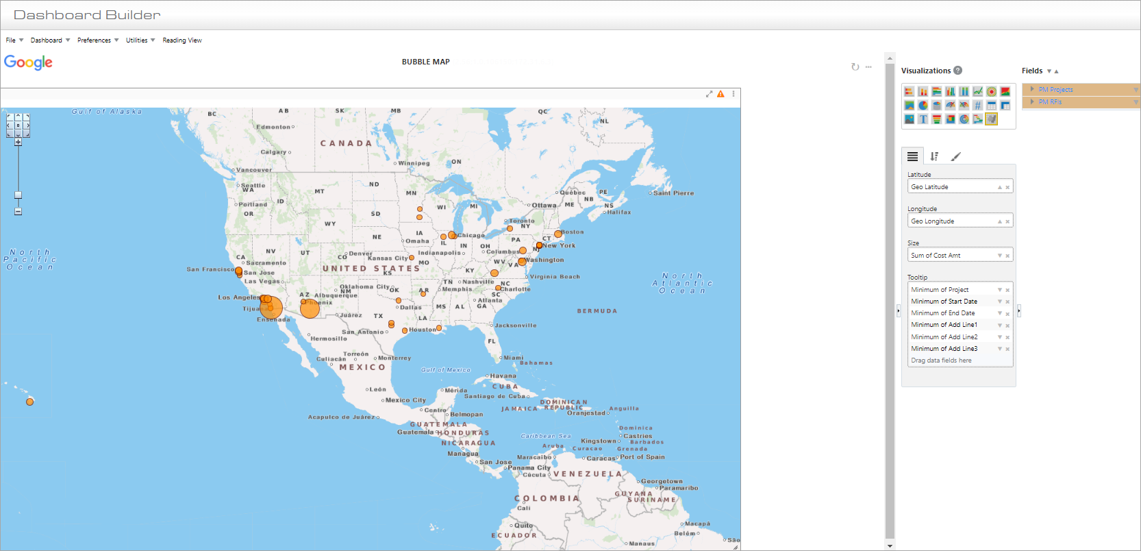
Example of Bubble Map Visualization
Data fields dragged and dropped from the Fields pane into the Plotting Fields tab are used to generate the tooltip that pops up when a user hovers over a specific bubble on the map.
Latitude
A numeric field containing the geographic latitude of the bubble locations.
Longitude
A numeric field containing the geographic longitude of the bubble locations.
Size
Used to determine the default size of the bubbles, which can be proportionally increased in the Format tab.
Tooltip
Used to display additional properties in the tooltip regarding a location on the bubble map.
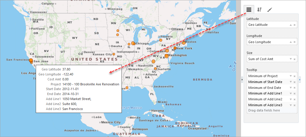
Tooltip on Bubble Map Visualization
Part 2: Sort & Filter
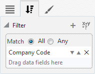
For details about filtering the data used by a bubble map, please refer to Sort and Filter – Tab.
Part 3: Format
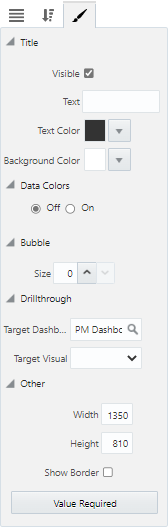
Title
Visible – Checkbox: Used to show/hide the title.
Text: Used to set the title for the visualization, which is displayed along its header.
Text Color : Used to set the text color of the visualization's title.
Background Color: Used to set the background color of the title.
Data Colors
Off/On: Used to turn the Data Colors property on and off. Selecting the 'On' radio button launches a pop-up window where colors can be specified for each data series in the visual. Users can choose between a Basic and Advanced color editor. Refer to Color Controls for more information on how this property is used.
Bubble
Size: Used to increment/decrement the size of the bubbles on the map. The default size is "0" with the Decrement arrow disabled. Once the size is incremented by "1" using the Increment arrow, the Decrement arrow will become enabled.
Drillthrough
Target Dashboard: Used to specify a drillthrough target to a dashboard.
Target Visual: Used to specify a drillthrough target to specific visual on a dashboard (when a target dashboard has been selected in the Target Dashboard field above).
Other
Width: Shows the width of the visualization (editable to allow the user to adjust width).
Height: Shows the height of the visualization (editable to allow the user to adjust height).
Show Border – Checkbox: Check to apply border to visualization.
[Value Required] - Button
This button is used to launch the Value Required pop-up window, where available dashboard filters/substitution variables are listed. Refer to Value Required for more information.
Using Multiple Data Points in One Location
The Bubble Map visualization allows for multiple data points in the same location, with the option to remove aggregation in the tooltip. This allows for a tabular view in the tooltip, and a visual indicator on the bubble to indicate that multiple records are being displayed.
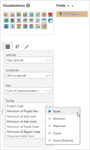
Remove aggregation (set aggregation option to “None”) for a tooltip plotting field. This makes it possible to retrieve entities sharing the same location.
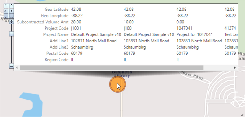
The bubble size is taken from the largest entity. Its tooltip text lists the information of all entities at the location.