 Search Tips
Part 1: Plotting Fields
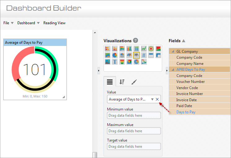
Example of Gauge Visualization
Value
This plotting field is used to set how the value displayed at the center of the gauge is calculated. To set the value, drag in the relevant field from the Fields pane that is to be inputted into an aggregate function to calculate the value. Upon dragging in the field, a default aggregate function will be applied, according to the field’s data type. Use the down-arrow ( ) to bring up a popup to select a different aggregate function, if required.
This value can be displayed as a number or as a percentage of the gauge’s max value, as set by Callout Value option on the Format tab of this control.
Minimum Value
This plotting field is used to set the gauge’s minimum value, by dragging in a field from the Fields pane. The value is then calculated using the dragged-in field and the default aggregate function for its data type. If the dragged-in field is of the string or date type, the default function is Count, and if it is of the number type, the default function is Sum.
Maximum Value
There are two ways to set the gauge’s maximum value: via this plotting field or via the Max field under the Gauge Axis option on the Format tab. This field takes precedence over the one on the Format tab.
For this field, the maximum is calculated using the dragged-in field and the default aggregate function for its data type. If the dragged-in field is of the string or date type, the default function is Count, and if it is of the number type, the default function is Sum.
If the maximum value is not provided, it will be calculated by doubling the current value, which essentially sets the gauge’s current value in the middle of the gauge. Therefore, the start value (minimum value) will be set to “0” and the end value (maximum value) will be set to double the current value. We recommend that users specify the source for the maximum value, either through this Maximum Value plotting field or through the Max field under the Gauge Axis option on the Format tab, if a maximum value is required on the gauge’s visualization.
Target Value
There are two ways to set the gauge’s target value: via this plotting field or via the Target field under the Gauge Axis option on the Format tab. This field takes precedence over the one on the Format tab.
This plotting field is used to set the gauge’s target value, by dragging in a field from the Fields pane. The value is then calculated using the dragged-in field and the default aggregate function for its data type. If the dragged-in field is of the string or date type, the default function is Count, and if it is of the number type, the default function is Sum.
Part 2: Sort & Filter
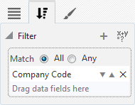
For details about filtering the data used by a gauge, please refer to Sort and Filter – Tab.
Part 3: Format
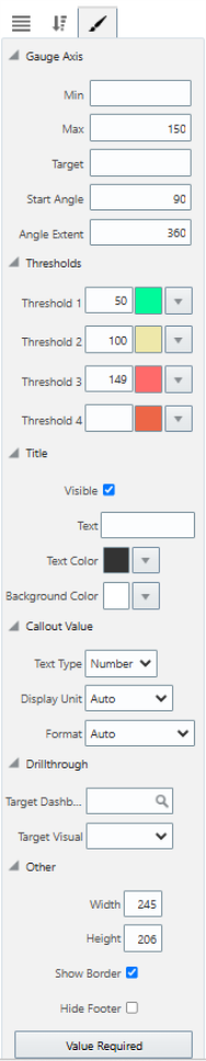
Gauge Axis
| Attribute | Details |
|---|---|
|
Min |
Minimum value of gauge’s range. |
|
Max |
Maximum value of gauge’s range, which can also be set on Plotting Field tab; setting on Plotting Field tab takes precedence. |
|
Target |
Gauge’s target value, displayed as line on gauge, which can also be set on Plotting Field tab; setting on Plotting Field tab takes precedence. |
|
Start Angle |
Position at which gauge’s range starts; if Angle Extent (following attribute) is set to 360, the range starts at the following clock positions for the following values:
|
|
Angle Extent |
This setting affects the gauge’s shape, e.g., if set to 180, the gauge is a half-circle. |
Thresholds
There are four thresholds that can be defined. For each one, set its maximum value and the color for its range.
Title
Visible – Checkbox: Used to show/hide the title.
Text: Used to set the title for the visualization, which is displayed along its header.
Text Color : Used to set the text color of the visualization's title.
Background Color: Used to set the background color of the title.
Callout Value
Text Type: Used to set whether the value displayed by the gauge is displayed as a number or as a percentage of the max.
Display Unit: Used to set the value’s display unit (e.g., thousands, millions, billions, etc.), if desired; otherwise, default display unit is set to “Auto”. (Note: This property is only applicable if the Text Type is “Number”.
Format: Used to set the number format of the displayed value to show more or less digits, if desired; otherwise, default format is set to “Auto”. This property supports up to three decimal places for a percent value.
Drillthrough
Target Dashboard: Used to specify a drillthrough target to a dashboard.
Target Visual: Used to specify a drillthrough target to specific visual on a dashboard (when a target dashboard has been selected in the Target Dashboard field above).
Other
Width: Shows the width of the visualization (editable to allow the user to adjust width).
Height: Shows the height of the visualization (editable to allow the user to adjust height).
Show Border – Checkbox: Check to apply border to visualization.
Hide Footer – Checkbox: Check to hide footer at bottom of gauge.
[Value Required] - Button
This button is used to launch the Value Required pop-up window, where available dashboard filters/substitution variables are listed. Refer to Value Required for more information.
Gauge (Number)
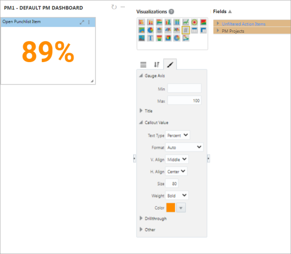
Another variation of the gauge is the Gauge (Number) visualization. It’s a gauge without a status indicator. The format of this visualization is similar to that of the standard gauge visualization described in the previous section, except for some additional format properties listed under the Callout Value:
Callout Value
Text Type: Used to set whether the value displayed by the gauge is displayed as a number or as a percentage of the max.
Display Unit: Used to set the value’s display unit (e.g., thousands, millions, billions, etc.), if desired; otherwise, default display unit is set to “Auto”. (Note: This property is only applicable if the Text Type is “Number”.)
Format: Used to set the number format of the displayed value to show more or less digits, if desired; otherwise, default format is set to “Auto”. This property supports up to three decimal places for a percent value.
V. Align (Vertical Alignment): Used to vertically align the value displayed by the gauge (alignment options are “Top”, “Middle”, or “Bottom” aligned).
H. Align (Horizontal Alignment): Used to horizontally align the value displayed by the gauge (alignment options are “Left”, “Centre”, or “Right” aligned).
Size: Used to define the font size of the displayed value.
Weight: Used to set the font-weight or thickness of the value’s font (font-weight options are “Bold”, “Normal”, or “Lighter”).
Color: Used to determine the color of the value displayed by the gauge.