 Search Tips
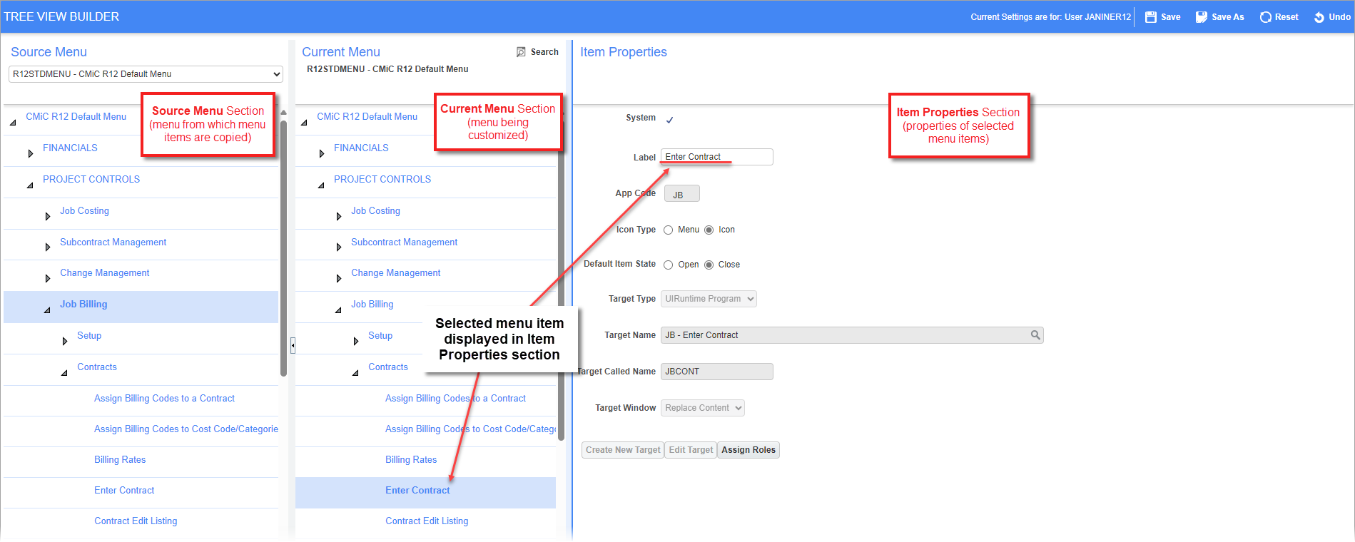
The Treeview Builder screen is comprised of three sections: the first two sections display Treeviews, and the third displays a selected menu item’s properties.
Source Menu – Section
The first section, Source Menu, contains a Treeview selected through the section’s drop-down list. The Treeview in this section is used to copy menu items in order to paste them into the Treeview being customized in the Current Menu section. The menus available in the Source Menu section are all base Treeviews. In other words, customized versions of base Treeviews, which are not named Treeviews, are not available in this section.
Current Menu – Section
The Current Menu section contains the Treeview being configured. It can be a base Treeview or a customized Treeview for a user or a UIC group. For details about how to load the relevant Treeview for configuring, please refer to the previous Loading & Saving Treeviews section.
Item Properties – Section
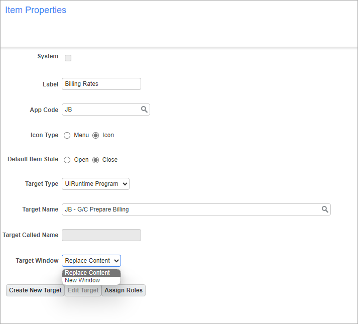
The Item Properties section displays a selected Treeview menu item’s properties. When a new menu item is created for a Treeview, this section is used to configure the new menu item. Menu items are either links to launch a target specified by a target object, or they are expandable and collapsible nodes that can contain other nodes and links.
The following provides details about the fields in this section.
System – Checkbox
This is a display-only checkbox that indicates if the menu item is standard (comes with Enterprise), or if it was created by a user.
Label
Label for the Treeview menu item.
App Code
Enter/select the application code. This code corresponds to a module of Enterprise.
Icon Type – Radio Button
Select the icon type.
Default Item State – Radio Button
Select the items default state.
Target Type
This field contains a list of all of the target types. For the type selected through this field, the Target Name field will list all targets of that type, including targets created by users for UI logs or dashboard.
Target Name
For the type selected through the Target Type field, this field lists all targets of that type, including targets created by users for UI logs or dashboard.
Target Window
This field specifies how a target gets displayed. If “Replace Content” is selected, the target will be displayed using the same browser’s tab. If “New Window” is selected, the target will be displayed on a new browser tab.
[Create New Target], [Edit Target] - Buttons
Since menu items can be links to launch targets, if you want a menu item to launch a newly created UI log or dashboard, a target object must first be created for the new UI log or dashboard. Once the target is created, it can be assigned to a menu item through the Target Name field.
The [Create New Target] button launches the screen used to create new target objects, and the [Edit Target] button is used to edit target objects.
For details about creating a new target, please refer to the following subsection in this guide: Configure Treeview > Create New Target.
[Assign Roles] - Button
The [Assign Roles] button is used to assign a security role (standard Treeview path: System > Security > Roles > Define Roles) to a menu item. If security roles are assigned to a menu item, the menu item will only be available to members of the security roles.