 Search Tips
NOTE: If you wish to save modifications, but the [Save] button is disabled, tab away from the current field to trigger the enabling of the [Save] button.
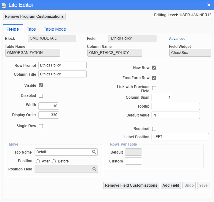
The following provides details about the fields and buttons on this tab.
Block
Display only; displays name of block (section) that field is in.
Field
Display only; Field’s label.
Table Name
Display only; Table in which field’s value is stored.
Column Name
Display only; Name of table’s column in which field’s value is stored.
Field Widget
Display only; displays field’s type: CheckBox, InputText, CommandButton, SelectManyDropDownList.
Row Prompt
Label of field when screen is in form mode, showing a single record (not applicable to titles of columns in tables).
Column Title
Label of field, as a column header, when screen is in table mode, showing multiple records.
Visible – Checkbox
If checked, field is visible, otherwise, field is hidden.
Disabled – Checkbox
If checked, field is visible, but disabled.
Width
Width of field.
Height
Height of field.
Display Order
Order field is displayed in relation to the other fields.
Single Row – Checkbox
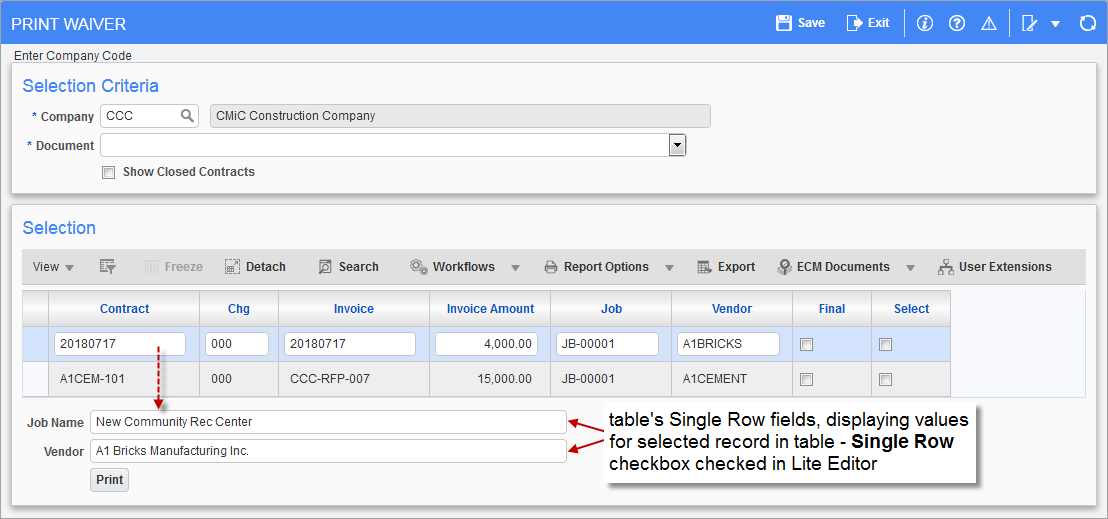
This option is applicable to tables shown on screens in Form Mode. It is used to flag specific fields in a table of records so that when an individual record in the table is selected, any fields that are flagged with this option will be displayed separately in single rows along the bottom of the table. For example, if a table’s field has the 'Single Row' checkbox checked in the Lite Editor, the field will appear as a single row under the table and the field’s value will be populated according to the record selected in the table, as shown in the screenshot above.
NOTE: This option is not supported in Table Mode and if enabled on a field will result in the column not being displayed in the table.
New Row – Checkbox
Applicable to fields in a field area, not in tables; only the first fields of a row have this checkbox checked; if a row’s first field has its ‘New Row’ box unchecked, the row’s fields will be appended to the end of the previous row; for a field that is not first in a row, if its ‘New Row’ box is checked, the field and the fields to its right will be moved to a new row.
Free-Form Row – Checkbox
This checkbox is used to set a row to a free-form row or grid row; for details, please refer to the previous subsection, Lite Editor - Free Form Rows, Grid Rows & Grid Columns.
Link with Previous Field – Checkbox
This option is relevant after adding a new custom field of the text type via the [Add Field] button’s pop-up, with pre-defined values entered via the [Valid Data] button’s pop-up. For details, please refer to the Lite Editor - [Add Field] - Button section in this guide.
If a new custom field of the text type has pre-defined values entered for it via the [Valid Data] button, the Text field will be a drop-down list, listing the entered values, and a display-only field will be placed to its right to display the description of its selected value, as follows:

These two types of fields should be linked by checking this box for the display-only field on the right. Linked fields are placed closer to each other, as shown below, and if the linked fields are in a grid row, the linked fields will be placed in the same grid column.
Column Span
Applicable to fields of a grid row; this field’s value sets how many grid columns a field spans; for instance, if this value is “2”, the field will span over two grid columns.
Tooltip
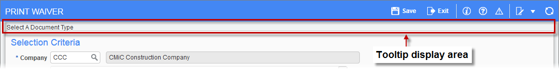
Use this field to provide a tooltip for the field, which will be displayed in the Tooltip area along the top of the screen, as shown above. Also, any relevant notes about or requirements for the field that are particular to your company can also be entered here.
Default Value
Default value for field when a new record is created.
Required – Checkbox
If checked, the field is required.
Required fields are validated only on inserts of a new record, or when the required field is edited for a saved record (note: validation is not triggered if other fields on a saved record are edited).
Label Position
This field is only available for checkbox type fields. Enter "Right" or "Left" to position the field label to the right or left of the checkbox.
Default
Display-only; displays the default number of rows displayed by the table.
Custom
Use this field to change the default number of rows displayed by the table, which affects the screen’s height; to do so, click any Edit icon in any row of the table (if table has no rows, click [Insert] to insert one and have the Edit icon available).
Tab Name
Use this field to select the tab to which the selected field (editor was launched for selected field) will be moved.
Position
Radio buttons; select “After” to move field to right of field selected via the Position field, or “Before” to move field to the left of the field selected via the Position field.
Position Field
This field works in conjunction with the Position radio buttons, and it is used to select the field that the field being moved will be moved next to, either to its left or its right.