 Search Tips
This button’s pop-up window is used to add a new field, spacer, heading, or separator to the block/section of the screen from which the Lite Editor was launched (selected block/section displayed by Block display-only field on the main Lite Editor screen).
NOTE: The fields available on this pop-up window change according to the action type selected.
The following table provides details about fields and buttons common to the pop-up window’s different action types. Details about the fields relevant to only particular action types are provided in the following subsections about the action types.
Action Type
Use this field to select the type of screen object (i.e., new field, heading, separator, spacer, or BI visualization) to add to screen.
To learn more about adding a BI visualization, refer to Lite Editor - Add BI Visualization to UIRuntime Program in Lite Editor using BiFrame.
Tab Name
Use this field to select the tab to which the screen object will be added.
Position
Radio buttons; select “After” to add object after the field selected via the Position Field LOV, or “Before” to add object before the field selected via the Position Field LOV.
Position Field
This field works in conjunction with the Position radio buttons, and it is used to select the field that the new object will be added next to, either before or after it.
New Row – Checkbox
Check this box if the object is to be added to a new line.
[Valid Data] – Button
Only visible after clicking [Save], if a new custom field is one of the following types (field type): text, number, multi-select text; this button’s pop-up window is used to enter the values to be made available to users for selection.
In the pop-up window, use the [Add] button to insert a new row, and the [Delete] button to delete a selected row.
[Clear] – Button
Used to clear entered details, and to re-start the pop-up window.
[Save] – Button
Used to save newly detailed screen object.
NOTE: If you wish to save modifications, but the [Save] button is disabled, tab away from the current field to trigger the enabling of the [Save] button.
The following provides details about the actions available via the Action Type field of the Add Field pop-up window.
Display Hidden Field – Action Type
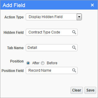
To display a screen’s hidden field, select “Display Hidden Field” from the Action Type field, then select the hidden field via the Hidden Field LOV.
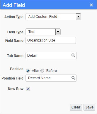
Add Custom Field – Action Type
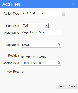
This option is used to add custom fields to a screen. The type of custom field to add is selected via the Field Type field.
NOTE: Fields that are added in Lite Editor are not system level constructs, so they are not fields that can be managed through UIRuntime Field Security. There is no field security available for User Extension (UE) custom fields.
As shown above, after the details are entered, the [Save] button becomes enabled to save the new custom field.
After clicking save, if the custom field is of one of the following types: text, number, or multi-select text, the [Valid Data] becomes available, as shown below:
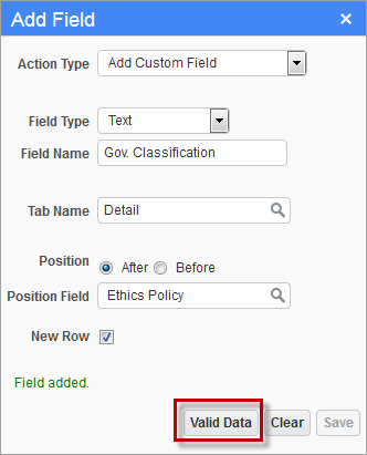
If applicable, use the [Valid Data] button’s pop-up window to enter values to be made available to users for selection.
The following provides details about the addable custom fields.
Text – Field Type
There are two types of custom text fields that can be added to a screen:
1. Simple Textbox (No pre-defined values)

Shown above is a sample of the simple textbox version of the text custom field type. To add a Text field of this type instead of the drop-down list type, simply do not provide pre-defined values via the [Valid Data] button. If pre-defined values are provided, the text field will be of the drop-down list type.
2. Drop-Down List (Pre-defined values available for selection)

Shown above is a sample of the drop-down list version of the text custom field type, which comes with an accompanying display-only field to its right that displays the description for the drop-down list’s selected value.
To add a text field of this type instead of the simple textbox type, provide pre-defined values via the [Valid Data] button. If pre-defined values are provided, the text field will be of the drop-down list type.
Also, to attach the display-only field to its drop-down list, as shown below, after the custom field is added to a screen, and the screen is reloaded, put the screen in edit mode via the Lite Editor and click the display-only field’s Edit icon. Then, check its ‘Link with Previous Field’ checkbox and click [Save] to link the two fields together as follows:
Number – Field Type
There are two types of custom number fields that can be added to a screen.
1. Simple Number-Box (No pre-defined values)
Shown above is a sample of the simple number-box version of the number custom field type. To add a number field of this type instead of the drop-down list type, simply do not provide pre-defined values via the [Valid Data] button. If pre-defined values are provided, the number field will be of the drop-down list type.
2. Drop-Down List (Pre-defined Values Available for Selection)

Shown above is a sample of the drop-down list version of the number custom field type.
To add a number field of this type, provide pre-defined values via the [Valid Data] button. If pre-defined values are provided, the field will be of the drop-down list type.
Date – Field Type

Shown above is a sample of the date custom field type, which comes with a date picker  .
.
Checkbox – Field Type

Shown above is a sample of the checkbox custom field type.
MultiSelect Text – Field Type

Shown above is a sample of the multi-select text custom field type.
After providing a name for the field via the Field Name field, tab away from the field to enable the [Save] button. After saving, the [Valid Data] button becomes enabled to enter the values that are to be made available for selection. Shown below is a sample of a multi-select text custom field with its drop-down arrow clicked.
Add Pre-Defined Field (User Defined Field) – Action Type
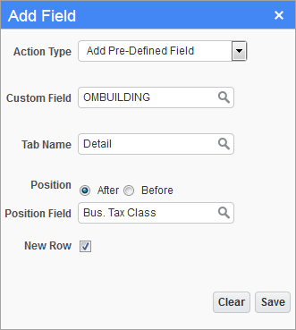
This option is used to add a user extension field (user defined field) to a screen.
The fields available for the Custom Field LOV are maintained via the User Extension Field Maintenance screen (standard Treeview path: System > User Extensions > Field Maintenance).
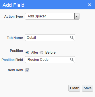
This option is used to add a spacer to a screen, which is simply an empty row, to separate groups of related fields.
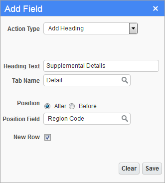
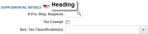
This option is used to add a heading to a screen, as shown below, to group related fields:
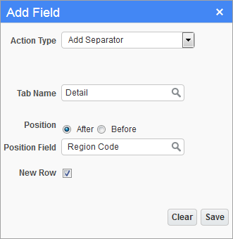
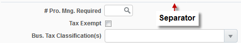
This option is used to add a separator to a screen, as shown below, to group related fields.
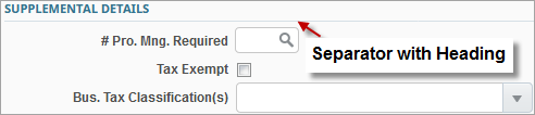
Add Separator with Heading – Action Type
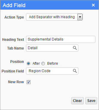
This option is used to add a separator with heading to a screen, as shown below, to group related fields.