This video provides an overview of the Crosstab visualization.
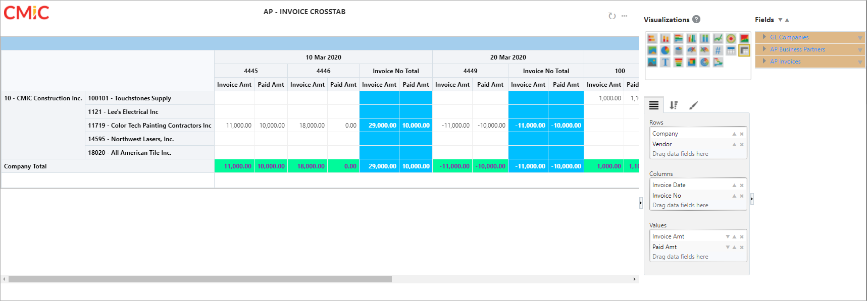
Example of Crosstab Visualization
The Crosstab visualization allows users to arrange row headings, column headings, and values using drag and drop, and the resulting arrangement is saved. This gives users the ability to change the edge position by moving or swapping.
NOTE: The ability to arrange the edges by drag and drop with the arrangement saved is also available in Crosstab view.
Hover over the row heading, column heading, or value until the Crosshair icon ( ) appears. Click and drag the item on the Crosstab visualization and drop it in the desired location. Possible locations are highlighted in blue as the item is dragged across the visualization to help guide the user to a final position.
The following screenshots show examples of arranging a row heading, column heading, and value.
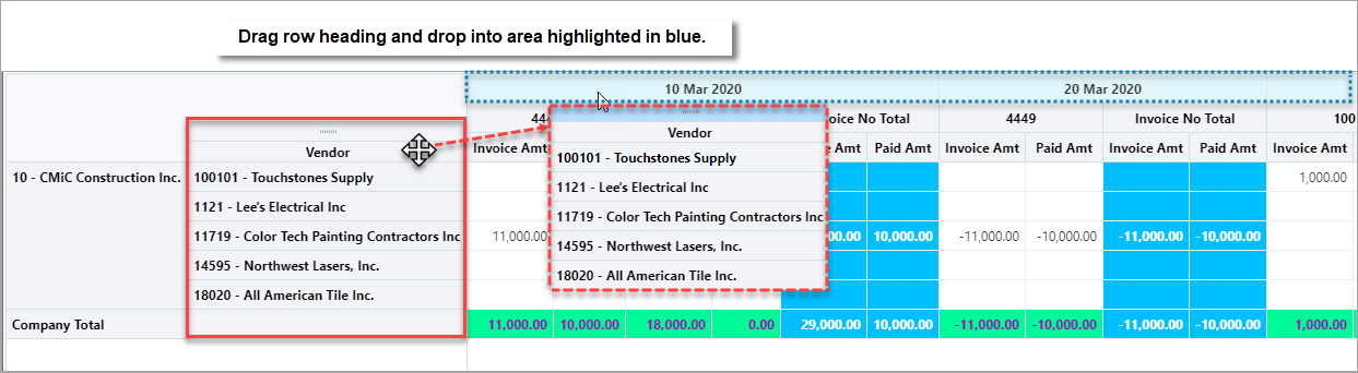
Re-arranging Row Heading in Crosstab Visualization
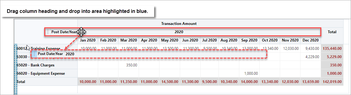
Re-arranging Column Heading in Crosstab Visualization
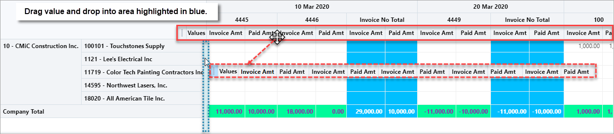
Re-arranging Value in Crosstab Visualization
NOTE: The ability to export to Excel is also available in Crosstab view.
Part 1: Plotting Fields
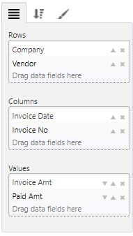
Refer to Part 1: Plotting Fields for details about dragging and dropping fields into this tab. This tab is used to select the fields to be used as the row headings, column headings, and values.
NOTE: For subtotal/total to be available, all “Values” fields must use one of the following aggregations: Count, Count (Distinct), or Sum.

The screenshot above shows an example of displaying available properties on the selected fields.
Part 2: Sort & Filter
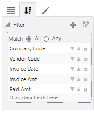
Refer to Part 2: Sort & Filter for details about filtering.
Part 3: Format
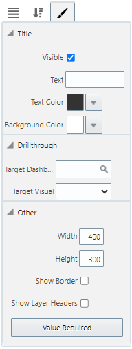
Refer to Part 3: Format for details about formatting.