Why is it Useful?
CMiC has added an expected cost dashboard to BI Analytics. This dashboard displays the cost spread over time on the current selected project and for a list of similar projects. Project Managers and other users can use this dashboard to estimate how costs on a project will spread out over time between now and the project end date. This can be done on a project level, a cost code level, or a cost-category level.
NOTE: This feature was released in Patch 15-2.
How Does it Work?
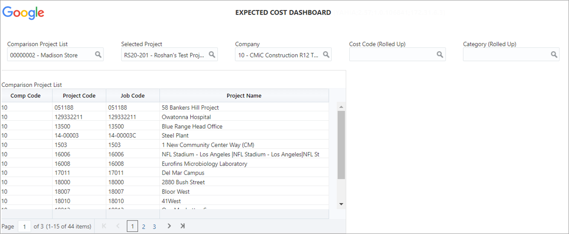
The table shows the list of projects in the Comparison Project List that is selected on the top left filter. This list is generated from the Opportunity Management - Proposal Workspace screen or the Comparison Projects screen.
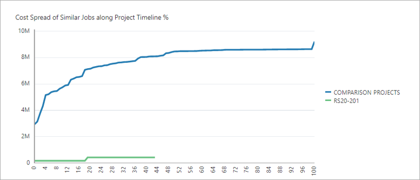
The first line chart shows the cumulative cost spread for comparison projects in the blue line. The green line shows the current selected project for comparison. The chart x-axis describes the time as a percent from project start date to end date. This is a basic benchmark. See JC Expected Cost 1 for information on how the data is calculated.
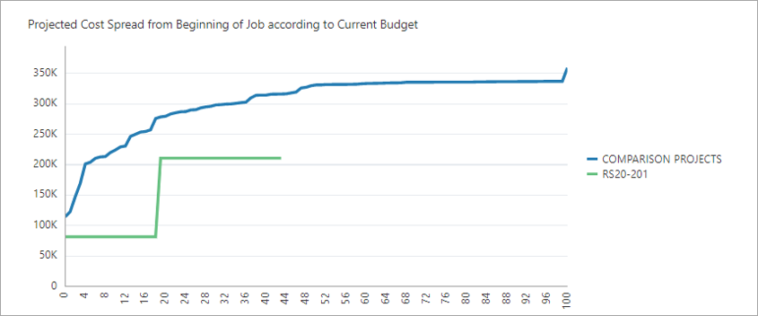
The second line chart shows the same information, except the “comparison” line is scaled by the budget of the current selected project. This is one form of a benchmark. See JC Expected Cost 2 for information on how the data is calculated.
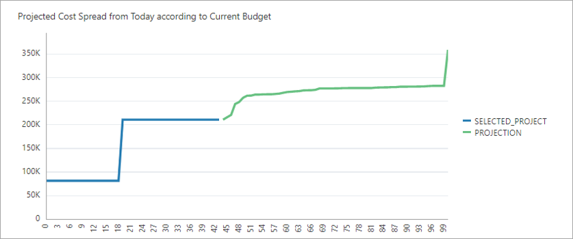
The third line chart shows the same information as the second, except the comparison line is a continuation of the selected project line. This is more akin to a cash flow projection. See JC Expected Cost 3 for information on how the data is calculated.