Overview
This video provides a tutorial for using profit fade.
Profit fade is a concept that has many names, including revenue fade and fee erosion. It is used to describe when the profit at the end of the project is less than what was predicted at the beginning of the project. Projects, despite your best efforts, can cost more than anticipated. In some cases, this is mitigated through change orders or new contracts, but many changes may be unbillable. Material costs may have been estimated poorly, or weather-related delays may occur, and so on.
It is possible to mitigate profit fade if the source of it is caught early. This can be done by monitoring how cost (and revenue) projections are changing over time. Mid-way through a project, a Project Manager can see that the projected cost has increased compared to the beginning of the project, and investigate the root cause.
In CMiC, cost and revenue projections at the bill code level are performed in Contract Forecasting, as shown below. Each period, when these forecasts are updated and stored using the [Store Forecast] button at the top of the screen, they are sent to a table that can be viewed in CMiC Analytics. We will use this data to create a Profit Fade dashboard.
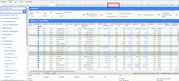
Contract Forecast with PCI Projections; standard Treeview path: CMiC Field > Budget & Cost Management > Contract Forecasting
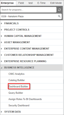
Perform Setup in Catalog Builder
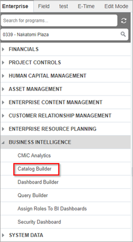
The first step to create the Profit Fade Dashboard is to access BI Catalog Builder and ensure that you have the joins and fields that are needed.
NOTE: For clients who do not have access to Catalog Builder, the Profit Fade Dashboard was released as a default object in Patch 15-1 for Cloud clients and in the first standard hotfix (HF-01) for Patch 15-1f for Enterprise clients.
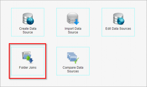
Click on Folder Joins.

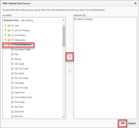
Select “JC Period Balances” along with “JC Job Phases”.
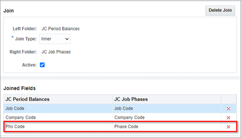
Ensure that the Phase Code is joined between the two folders.
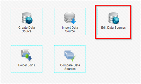
Click on Edit Data Sources.
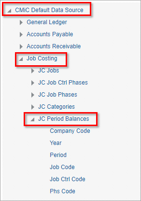
Navigate to “JC Period Balances”.
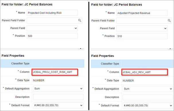
Look for two fields named “JCBAL_PROJ_RISK_AMT” and “JCBAL_ADJ_REV_AMT”. These two fields are the Projected Cost (including PCI risk) and Adjusted Projected Revenue, respectively.
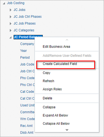
Create a date field using the Year and Period fields. This will come in handy when the dashboard is created. Right-click on “JC Period Balances” and click “Create Calculated Field”.
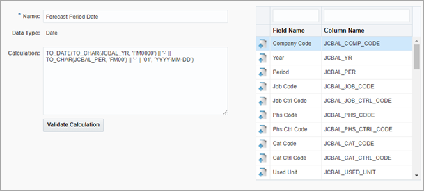
Enter the SQL statement shown above and set the Data Type to “Date”.
Create the Dashboard
The next step is to open BI Dashboard Builder and create a new dashboard.
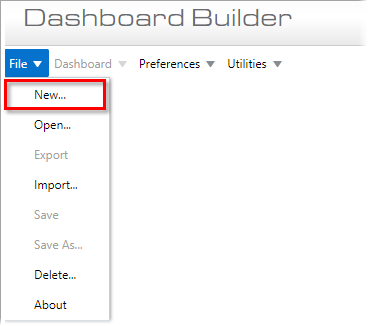
Select File > New to open the New Dashboard pop-up window.
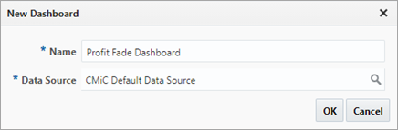
Enter a name for the new dashboard and select the data source. Use the same data source that you edited in BI Catalog Builder.
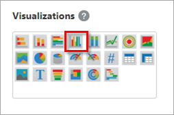
Your first visualization will be a clustered column chart. Select the "Clustered Column Chart" visualization.
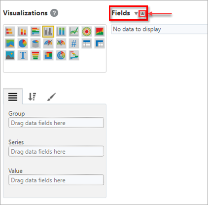
Click the up-arrow ( ) in the Fields pane to add fields (tables/views) to the visualization.
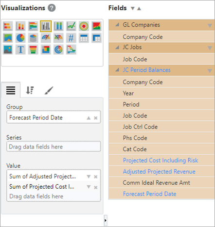
Add the JC Period Balances folder into the visualization.
The next chart will be a stacked column chart.
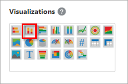
Click on your existing bar chart and then click on the icon for the stacked column chart.
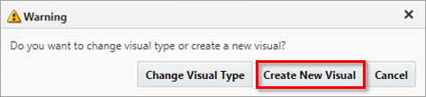
A warning prompt will appear. Click [Create New Visual] in the Warning pop-up window. This new visual will have the same data as the first visual.
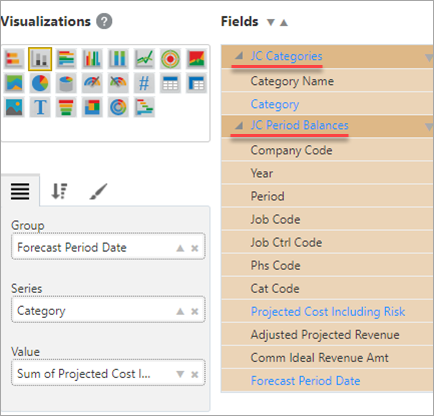
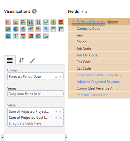
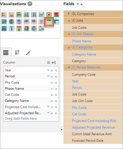
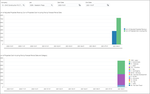
Add the JC Categories folder to the data fields. Move the fields into the Group, Series, and Value property boxes as shown above. This stacked column chart will break down the projected cost by category code.
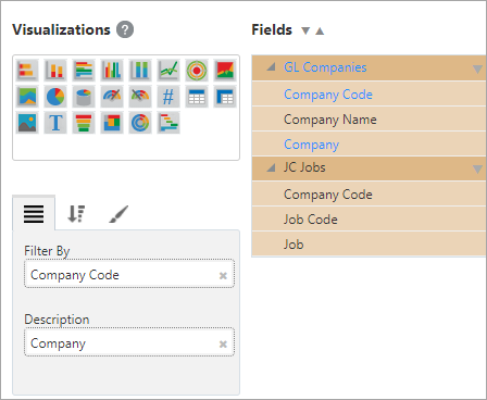
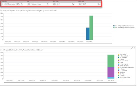
The dashboard will now show two column charts with data spanning all companies, all projects, and all time periods. Add page filters to filter the data by Company and Job as shown below.
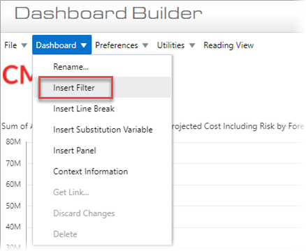
Select Dashboard > Insert Filter.
Duplicate the Company filter to create the Job filter.
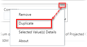
Select "Duplicate" in the filter's drop-down menu.
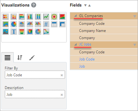
In order for the filters to take effect, bring the JC Jobs and GL Companies folders into both column charts.
The fields for the first column chart will appear as shown in the screenshot above.
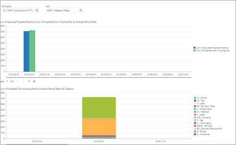
Your dashboard will now look similar to the one shown in the screenshot above.

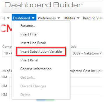
To create start and end date filters, click on Dashboard > Insert Substitution Variable.
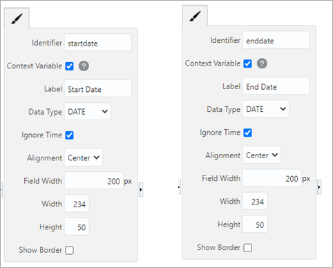
Insert two substitution variables to create the start and end date filters.
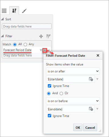
Implement the start and end date filters on both column charts by bringing the Forecast Period Date field (the one created earlier in BI Catalog Builder) into the Filter property box.
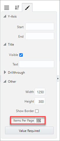
Finally, reduce the number of pages on each column chart by increasing the number of items per page.
The dashboard now has filters for Company, Project, Start Date, and End Date.
NOTE: The start and end dates are not project start and end dates. They are used to filter the dates of each contract forecast (which are stored once a month over the lifetime of a project).
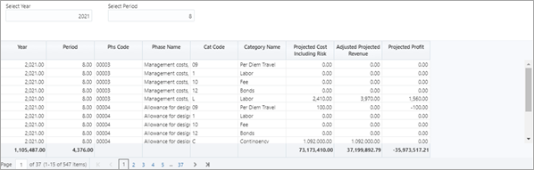
Create Drill-Down Table
Create a table that allows you to drill down to individual bill items as shown in the Contract Forecasting screen in CMiC Field (standard Treeview path: CMiC Field > Budget & Cost Management > Contract Forecasting).
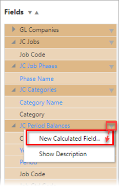
Create a new calculated field to represent Projected Profit by clicking on the down arrow ( ) beside the JC Period Balances folder in the Fields pane and selecting "New Calculated Field", as shown above.

Use the pop-up window to create a NUMBER visualization calculated field.
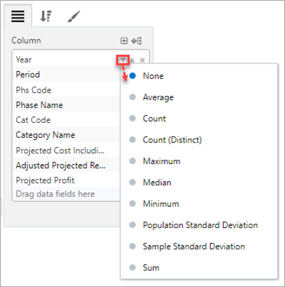
Next, ensure that every field in the table is not aggregated. Click the down-arrow ( ) and select “None” in the aggregation drop-down menu for each field.
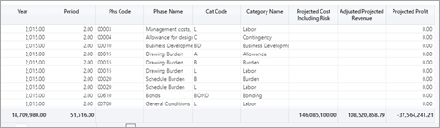
The table will now look similar to the table shown above.
You will now create two new substitution variables to filter the data in the table. This is because the table will require more drilling down – to a single period and not a range of periods. Select Dashboard > Insert Substitution Variable.
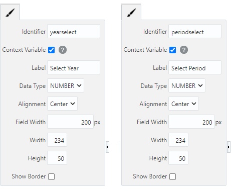
Insert two substitution variables, one for year and one for period.
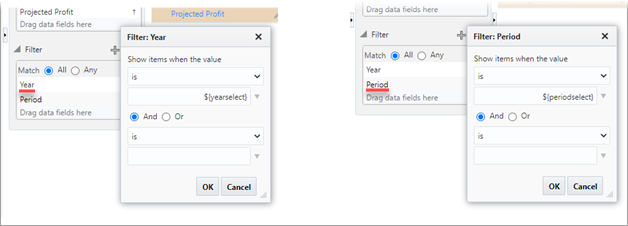
Add substitution value expressions to the fields in the Filter panel.
The dashboard will appear as shown above, with two column charts and one drill-down table.
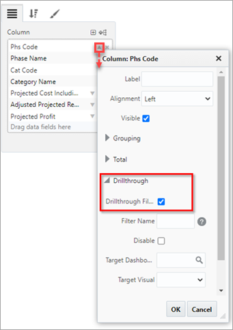
Finally, allow the table to be used as a drill-down for the two bar charts. Do this by setting the Phs Code field to be a drillthrough filter.
Track Profit Fade
This dashboard can be used in the following way to track profit fade over the lifetime of the project:
-
Select Company, Job, Start, and End dates for the analysis.
-
Click on a period of interest or a category of interest on one of the column charts.
-
Inspect the drill-down table for more details on that period or category.
-
Click on a specific phase code in the table to see how the cost and revenue projections have changed over time.