 Search Tips
Part 1: Plotting Fields
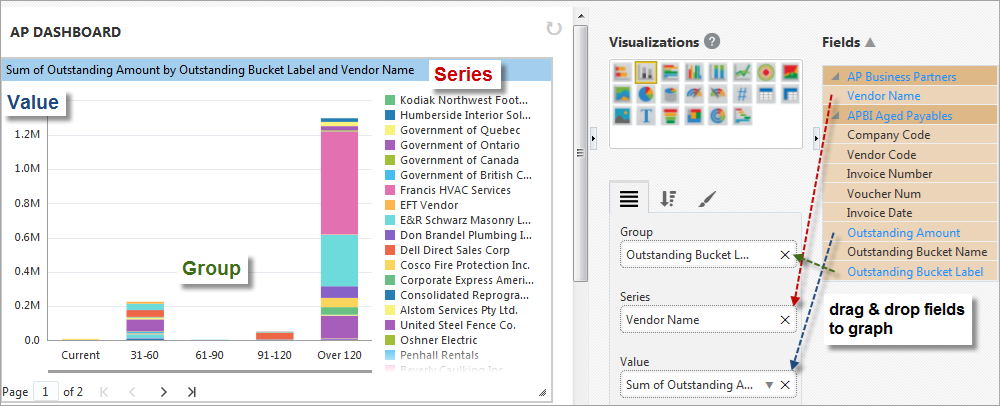
Example of Stacked Column Chart Visualization
Group
For the aggregate value displayed by the Value plotting field (e.g., Sum of Outstanding Amount in above screenshot), its component values (i.e., subtotals) are grouped by the field dragged into this plotting field, and a bar/column graphically displays each group’s value in relation to the Value axis. If the Series plotting field is not used, these bars/columns are solid.
This plotting field is optional, and if it is not used, just one bar/column displays the aggregate value displayed by the Value plotting field.
Series (Subgroup)
Optionally, each group’s value, which is graphed using a solid bar/column if this plotting field is not used, can be further broken down into component values for the field dragged into this plotting field. If this Series plotting field is specified, the solid bar/columns are divided into colored segments for each Series item (e.g., Vendor Names in above screenshot).
Value
Result of inputting dragged in field into aggregate function defaulted or selected via the down-arrow ( ).
).
If both the Group and Series plotting fields are not used, just one bar/column displays this field’s aggregate value.
Part 2: Sort & Filter
For details about sorting the Groups and Series, please refer to Sort and Filter – Tab.
Part 3: Format
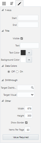
Y-Axis
Start: Value at which Y-axis is to start.
End: Value at which Y-axis is to end.
Title
Visible – Checkbox: Used to show/hide the title.
Text: Used to set the title for the visualization, which is displayed along its header.
Text Color : Used to set the text color of the visualization's title.
Background Color: Used to set the background color of the title.
Data Colors
Off/On: Used to turn the Data Colors property on and off. Selecting the 'On' radio button launches a pop-up window where colors can be specified for each data series in the visual. Users can choose between a Basic and Advanced color editor. Refer to BI Dashboard Builder - Color Controls for Visualizations for more information on how this property is used.
Drillthrough
Target Dashboard: Specifies a drillthrough target to a dashboard.
Target Visual: Specifies a drillthrough target to specific visual on a dashboard (when a target dashboard has been selected in the Target Dashboard field above).
Other
Width: Shows the width of the visualization (editable to allow the user to adjust width).
Height: Shows the height of the visualization (editable to allow the user to adjust height).
Show Border – Checkbox: Check to apply border to visualization.
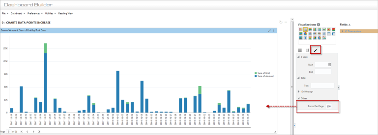
Items Per Page: Specifies how many data items are displayed per page in charts (maximum allowed value is 150).
[Value Required] - Button
This button is used to launch the Value Required pop-up window, where available dashboard filters/substitution variables are listed. Refer to Value Required for more information.